Matplotlib Pyplot#
Prerequisites#
Learning Outcomes#
Plot scatter and line plots of lists of data
Include axis labels
Modify the appearances of the plots
Be able to save your plot to a specified directory
Matplotlib and Pyplot#
Matplotlib is a comprehensive library for creating static, animated, and interactive visualisations. Within Matplotlib, the widely-used module Pyplot provides a fairly intuitive way of plotting, and is able to open interactive figures on your screen.
There are two different ways of using the library: an explicit or “Axes” interface, and an implicit “pyplot” interface. The explicit interfaces defines each figure explicitly and builds the visualisation step-by-step. The implicit method keeps track of the last Figure and Axes created and adds additional content to the object it thinks the user wants. If you are only plotting simple figures, the implicit method is sufficient, however if you wish to create multiple figures, you may run into problems trying to refer to the correct figure, and should use the explicit method. Be aware that many online examples will use the two methods interchangeably, and in some cases, at the same time. Have a look on the Matplotlib website for more information on the two interfaces.
For a discussion on explicit versus implicit interfaces, look to the end of the lesson. The rest of the lesson will only use the implicit interface.
To use matplotlib.pyplot simply import it. It is usually imported using the alias plt.
from matplotlib import pyplot as plt
This is importing the module pyplot from the library matplotlib and assigning it the alias plt. From here on, pyplot functions can be called using plt..
When a figure is generated, it will appear in a separate window, and can be manipulated.
Simple line and scatter plots#
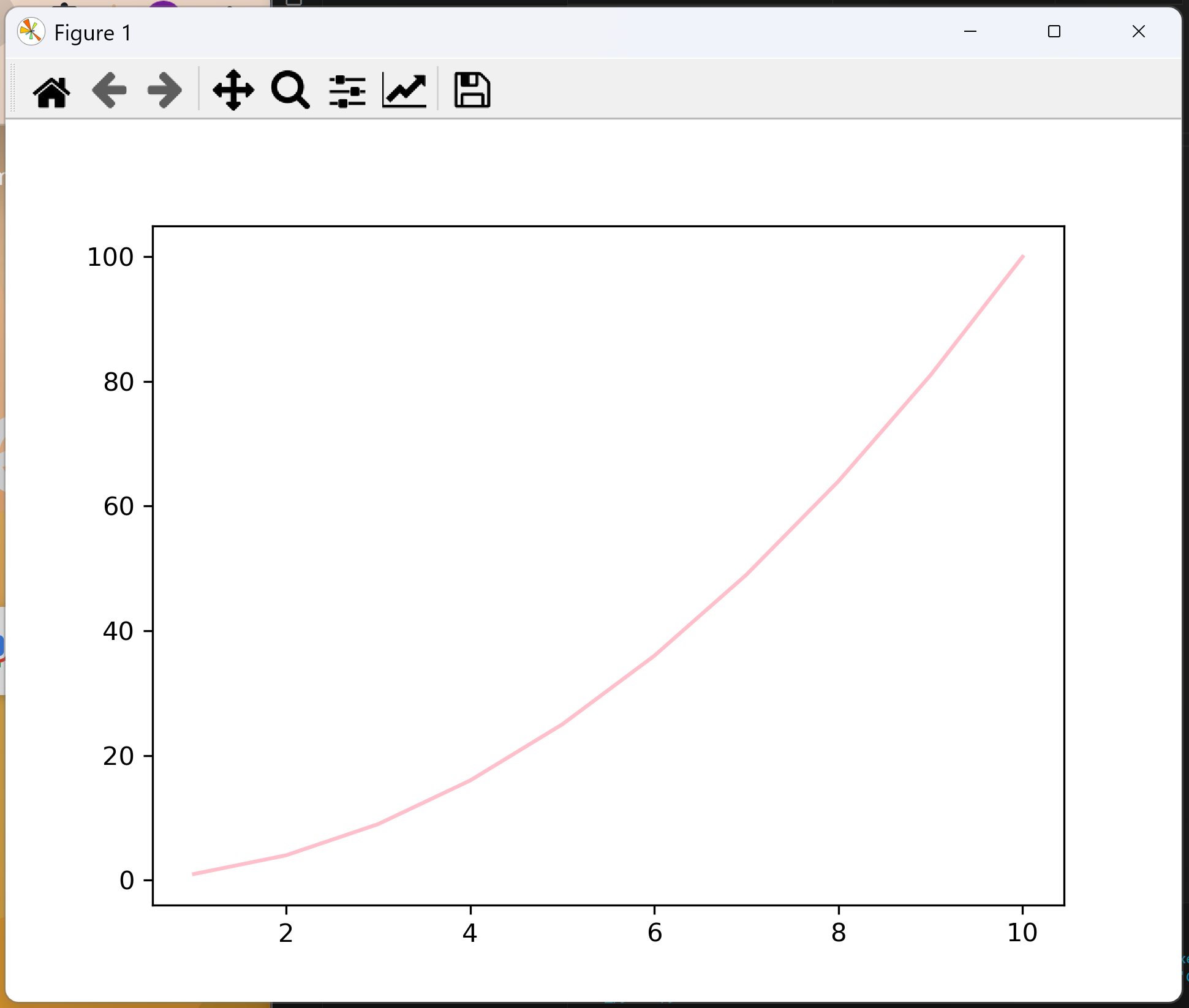
One of the most important commands within the pyplot module is plt.plot(x,y). This command instructs Python to produce a line plot of data contained in the list with variable name x on the horizontal axis and the data contained in the list with variable name y on the vertical axis. Each point is then connected with a straight line.
from matplotlib import pyplot as plt

x = [1,2,3,4,5,6,7,8,9,10]
y = [1,4,9,16,25,36,49,64,81,100]

plt.plot(x, y, color="pink")
plt.show()
The output is an interactive window with the graph on it.
Going through step by step:
First we import the module pyplot and assign it the alias
plt. You can do this in two ways, but they are equivalent:from matplotlib import pyplot as pltimport matplotlib.pyplot as plt
Next we have defined the data we are plotting. This is two lists, of x and y data.
We call the function using
plt.plot(x, y).This creates a figure and automatically sizes the axes.
The first two arguments of the function are the x and y data. If you only provide one list of data, it will automatically assign the x axis integer values from 0 upwards.
There are numerous keyword arguments that you can put here to affect design (discussed in the next section). This includes
color,linewidth,marker,linestyle, andmarkersize. Be aware that ‘color’ is spelled the US way.
plt.show()prints all created figures to your screen. In most IDEs this is required, but be aware that some IDEs (e.g. Jupyter) will automatically print the figure without needing this line.
If you wanted to create a scatter graph instead of a line graph, you can easily do this by replacing plt.plot() with plt.scatter().
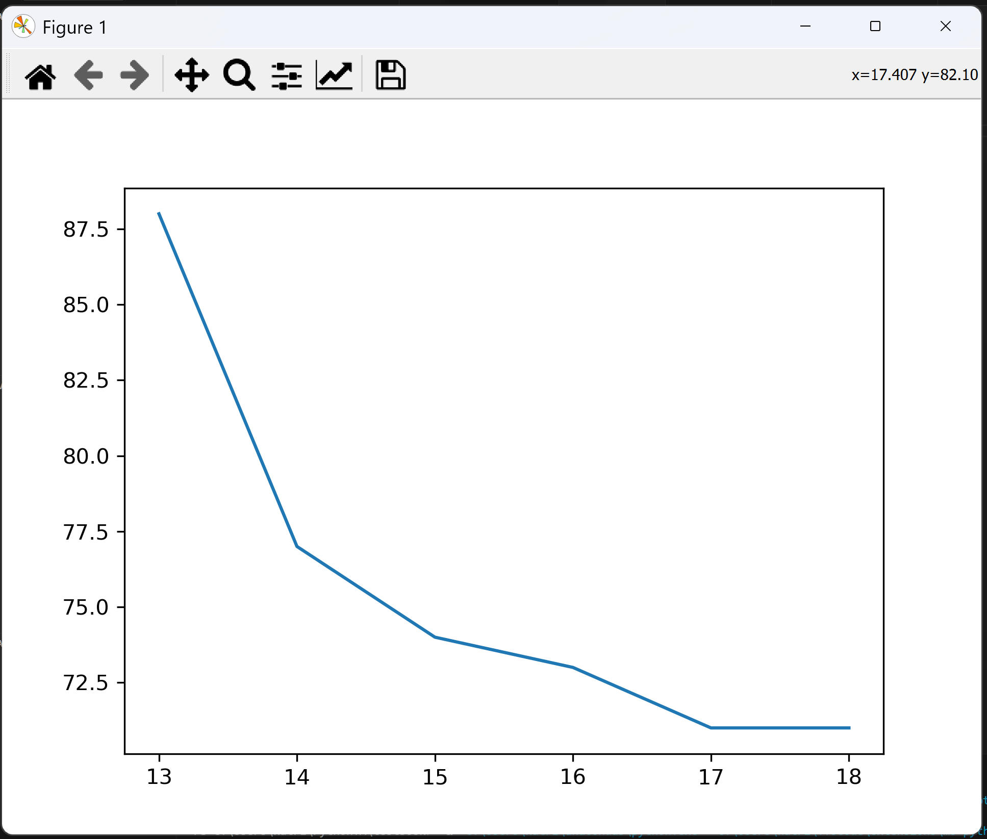
Exercise: Plot a line graph
Using the below lists for element group and corresponding radii, use Matplotlib.Pyplot to plot a line graph showing how atomic radii contract along a period.
element = ["B", "C", "N", "O", "F", "Ne"]
group = [13, 14, 15, 16, 17, 18]
radii = [88, 77, 74, 73, 71, 71] # pm
Click to view answer
As we want to plot a line graph, we use the function plt.plot().
from matplotlib import pyplot as plt

group = [13,14,15,16,17,18]
radii = [88,77,74,73,71,71]

plt.plot(group,radii)
plt.show()
The result is a line graph that looks like this:
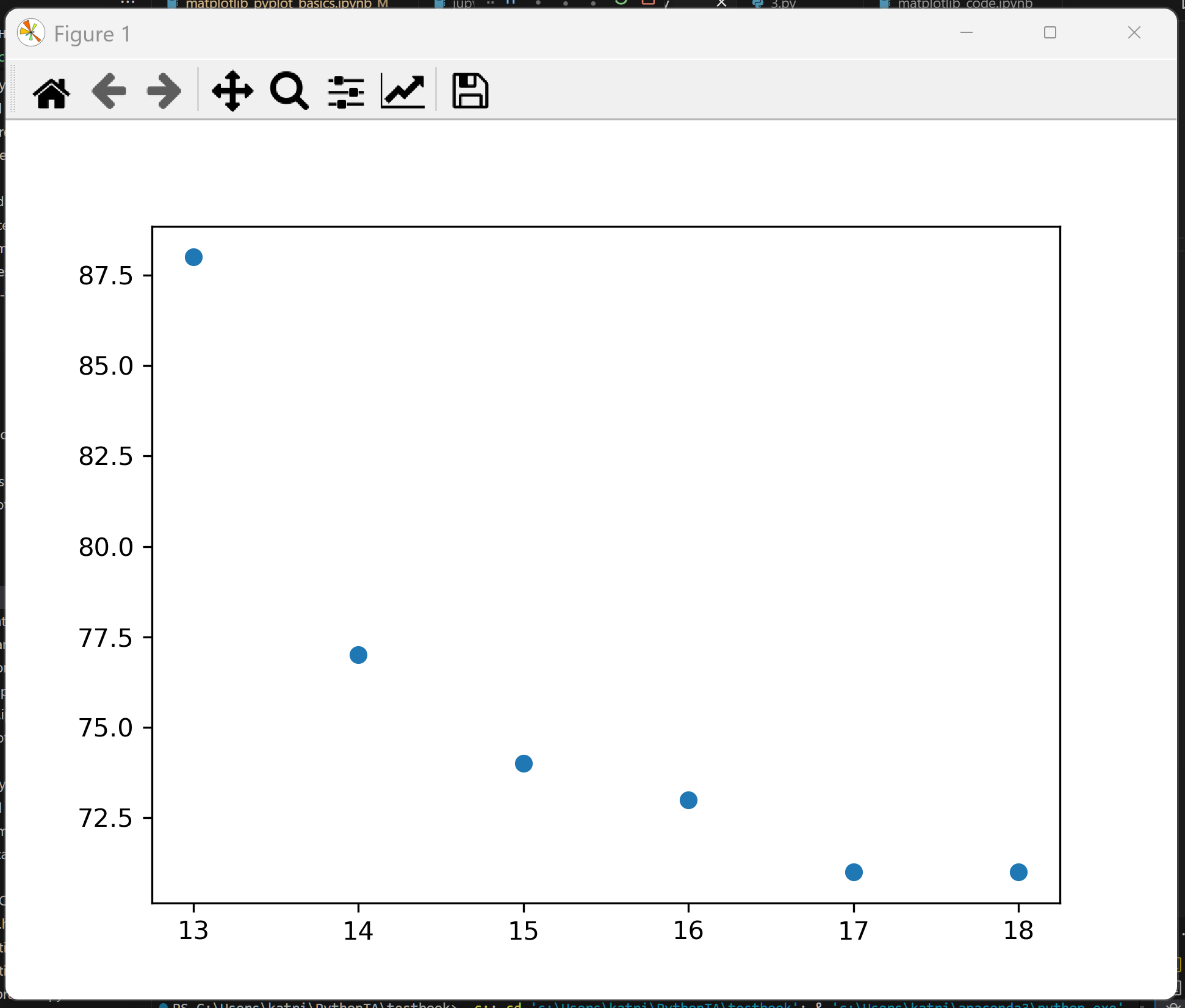
Exercise: Plot a scatter graph
Using the list of radii data for period 3, use Matplotlib.Pyplot to plot a scatter graph showing how atomic radii contract along a period.
element = ["Al", "Si", "P", "S", "Cl", "Ar"]
group = [13,14,15,16,17,18]
radii = [125,118,110,104,99,98]
Click to view answer
As we want to plot a scatter graph, we use the function plt.scatter().
from matplotlib import pyplot as plt

group = [13,14,15,16,17,18]
radii = [125,118,110,104,99,98]

plt.scatter(group,radii)
plt.show()
This results in a plot that looks like this:
Customising your plot (labels and design)#
There are numerous ways to improve your plot, mainly by making it look actually scientific. Below are various useful functions, from labels to design to mathematics which you can add to your graph. The Matplotlib documentation for all Pyplot functions can be found here, and an explanation as to the anatomy of a figure (what are labels, markers, legend, ticks, etc.) can be found here.
But be careful. This lesson gives all functions in their implicit forms. The matplotlib documentation gives them in their explicit forms. For a discussion on implicit versus explicit in Matplotlib, look at the last section in this lesson.
Styling a line or scatter points
The most basic adjustments you can make to your line or scatter plot is by using keyword arguments. For line styles, these are given by the Matplotlib Lines2D styles (a full description can be found here).
from matplotlib import pyplot as plt

x = [1,2,3,4,5,6,7,8,9,10]
y = [1,4,9,16,25,36,49,64,81,100]

plt.plot(x, y, color="red", linestyle="--", linewidth=2, marker="o", markersize=5, alpha=0.5)

plt.show()
This plot is the output:
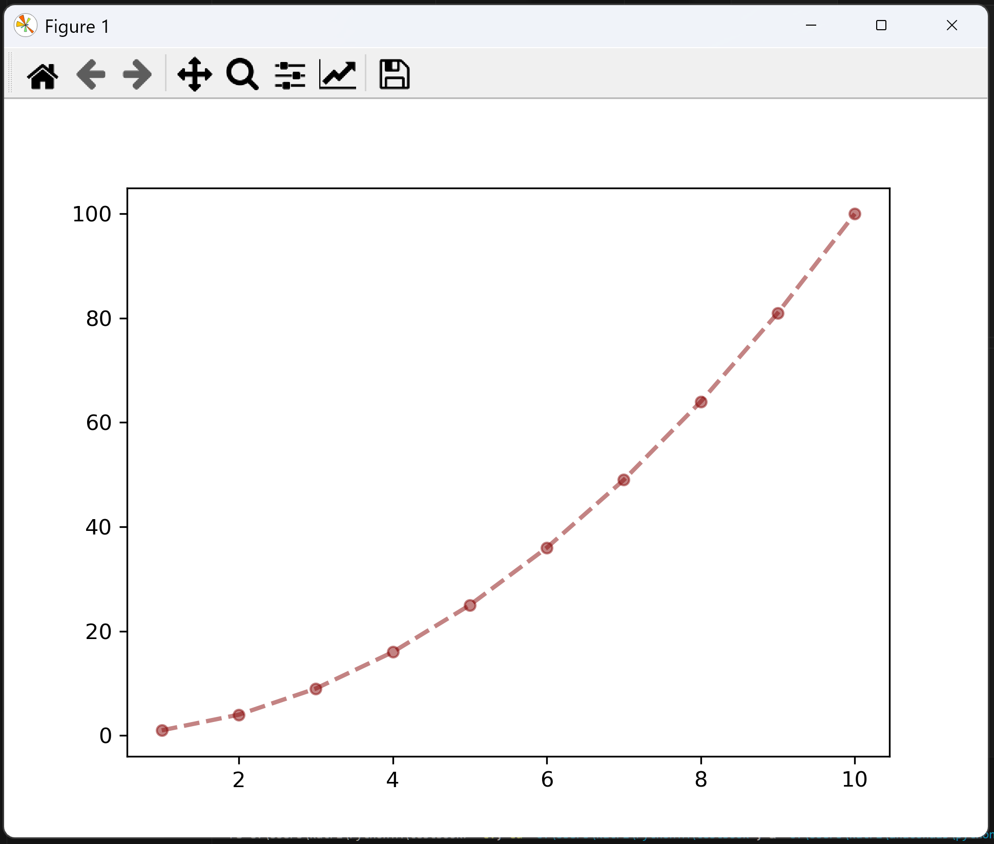
Run the above code and look at the resulting plot with and without the keyword arguments.
colorchanges the colour of the line. It can take certain named colours, such as"red","green", and"papayawhip", etc., or hex code colours, such as"#880808". If you do not use thecolorkeyword, the line will take a default colour, usually blue. A full list of Matplotlib supported colours can be found here.linestylechanges the style of the line. Without the keyword, this defaults to a solid line. Other inputs could be"-"(solid),"--"(dashed),":"(dotted),"-."(dashed-dotted), or""/"None"(draws nothing).linewidthchanges the thickness of our line. The default is 1.markerchanges the marker at each plotted point. By default in a line diagram these would be"None", however in a scatter plot these are a dot by default. Other kinds of marker could be"x"(a cross),"s"(a square),"D"(a diamond), or"v"(a downwards triangle). The full list of available markers can be found here.markersizechanges the size of the marker. The default can be changed, but is usually around 5.alphachanges transparency, where 1 is solid and 0 is totally transparent. In this case, it will change the transparency of both the line and the marker.
Adding labels to your graph
As with all science, it is important that your graph is showing useful information. A figure with no labels has no meaning. Below are the functions to add labels to your plot. Remember units!
Label |
Description |
Function |
Example |
|---|---|---|---|
Title |
Add a title to the top of the figure |
|
|
x-axis label |
Labels the x axis |
|
|
y-axis label |
Labels the y axis |
|
|
Legend |
Adds a legend. More information on legend design can be found here. |
|
|
Here is an example of code adding some labels onto the figure.
from matplotlib import pyplot as plt

x = [1,2,3,4,5,6,7,8,9,10]
y = [1,4,9,16,25,36,49,64,81,100]

plt.plot(x, y, color="#880808", linestyle="--", marker="o", linewidth=2, markersize=5, alpha=0.5)

plt.title("Quadratic Function")
plt.xlabel("x-axis", color="navy", fontweight="bold")
plt.ylabel("y-axis", color="pink", font="comic sans ms")
plt.legend(["y = x^2"])

plt.show()
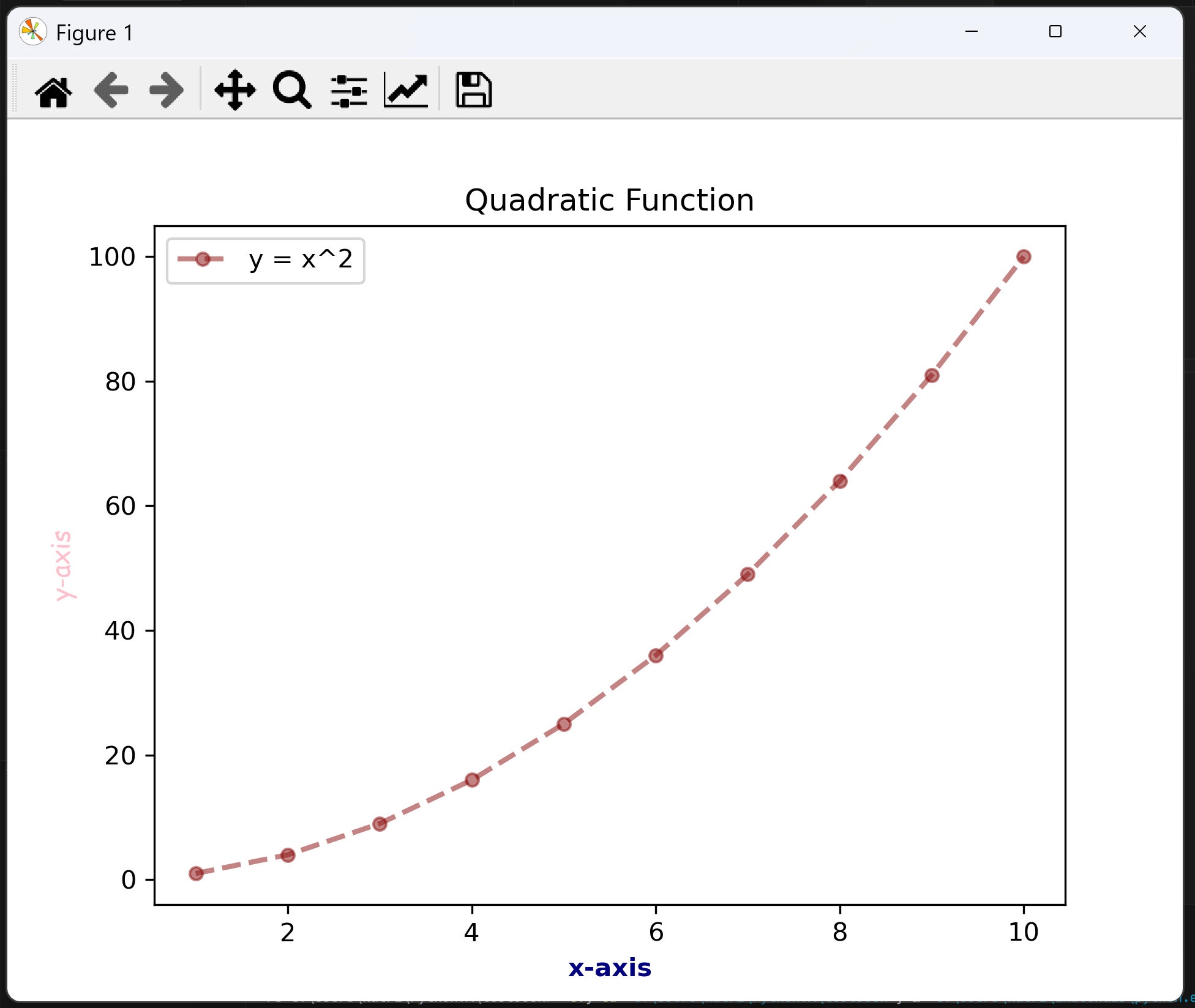
This example includes examples of the design elements you can add to text. This should not be taken as style advice. In reality, you should be consistent between all labels and style choices.
Some of the basic labelling styles you can add are:
colorsets the text colour. This can be a certain colourcolor="palegoldenrod", or a hex codecolor="#c4a998". A full list of Matplotlib supported colours can be found here.weightorfontweightsets the thickness of the font. This can be"normal","heavy","bold","light","ultrabold", or"ultralight".styleorfontstylesets the style of the font. This can be"normal","italic", or"oblique"(which is similar to italic).fontornameorfontnamesets the type of font. Matplotlib supports many basic fonts.sizeorfontsizesets the text size. This could be size in pixels,"100px", or relative to the current/default fontsize"smaller","x-large".alphasets transparency, taking values from 0 to 1.backgroundcolorhighlights behind the text, and can also be assigned either by certain names or by a hex code.
A full list of these design keywords can be found here.
Adding ticks, gridlines, and setting limits to your graph
In addition to line styles and labels, there are a number of graphical design elements that can really improve the look of a graph.
By default, a Matplotlib generated graph will contain auto-generated major ticks at auto-generated intervals, no grid squares, and limits just above and below the values of data. You can customise these to suit your purpose.
Element |
Description |
Function |
Example |
|---|---|---|---|
Legend |
Adds a legend. More information on legend design can be found here |
|
|
Grid squares |
Adds grid squares on either “major” ticks, “minor” ticks, or “both”. Add design with Line2D properties. |
|
|
x-axis ticks |
Manually changes ticks on the x-axis, add minor ticks with a kwarg (separately) |
|
|
y-axis ticks |
Manually changes ticks on the y-axis, add minor ticks with a kwarg (separately) |
|
|
x-axis limits |
Manually sets the first and last number on the x-axis |
|
|
y-axis limits |
Manually sets the first and last number on the y-axis |
|
|
Here is an example of our quadratic function plot customised with gridlines, ticks, and limits.
from matplotlib import pyplot as plt
import numpy as np

x = [1,2,3,4,5,6,7,8,9,10]
y = [1,4,9,16,25,36,49,64,81,100]

plt.plot(x, y, color="#880808", linestyle="--", marker="o", linewidth=2, markersize=5, alpha=0.5)

plt.title("Quadratic Function")
plt.xlabel("x-axis", color="navy", fontweight="bold")
plt.ylabel("y-axis", color="pink", font="comic sans ms")
plt.legend(["y = x^2"])

# Set the limits of the x and y axes
plt.xlim(0, 10)
plt.ylim(0, 100)

# Major ticks
plt.xticks([0, 2, 4, 6, 8, 10])
plt.yticks([0, 20, 40, 60, 80, 100])

# Minor ticks (using numpy 'arange' to quicky generate ticks)
plt.xticks(np.arange(0, 10, 0.2), minor=True)
plt.yticks(np.arange(0,100,2), minor=True)

# Major grid lines are blue
plt.grid(True, "major", color="blue", alpha=0.5)

# Minor grid lines are grey
plt.grid(True, "minor", color="grey", alpha=0.5)

plt.show()
This produces the following graph (styles and colours are to demonstrate technique and should not be considered guidance):
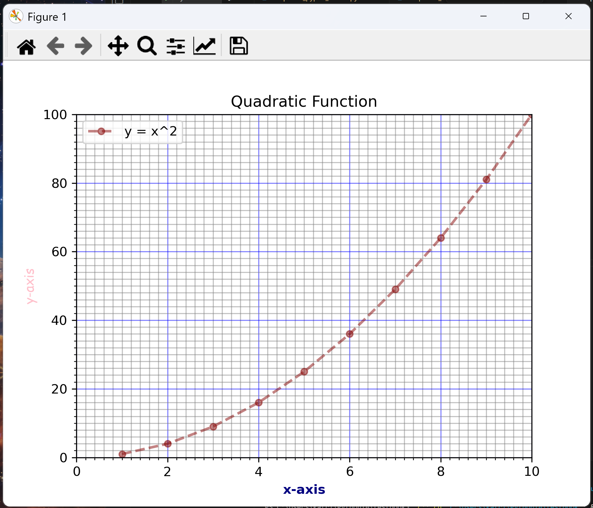
Walking through these additional bits of code:
plt.xlim(0,10)sets the left boundary of the x-axis to 0 and the right boundary to 10. The same is done forplt.ylim(0, 100), but with the bottom boundary being 0 and the top 100.plt.xticks([0, 2, 4, 6, 8, 10])andplt.yticks([0, 20, 40, 60, 80, 100])mark the numbers at which major ticks appear. These are the longer lines on the axes, marked with numbers.plt.xticks(np.arange(0, 10, 0.2), minor=True)andplt.yticks(np.arange(0,100,2), minor=True)mark the positions at which minor ticks appear. These are the shorter lines on the axes, not marked by numbers. This data should be given in a list or an array (arrays are basically powerful NumPy lists), and the functionnp.arange()(documentation here) is a very quick way to produce them. All it does is create an array from the first number to the second number in steps of the third number, for exampleno.arange(0,10,0.2)creates an array of numbers from 0 to 10 in steps of 0.2.plt.grid(True, "major", color="blue", alpha=0.5)sets the major grid lines to be blue, andplt.grid(True, "minor", color="grey", alpha=0.5)sets the minor grid lines to be grey. Thegrid()function can take anyLine2DStyle, discussed above. If you wanted to set both major and minor grid lines to the same style, you could use the keyword “both” instead of “major” or “minor” and use only one line.
Remember that a good scientific figure is consistent, labelled, contains units, and is easily readable. You should not have a mix of fonts, sizes, or a hodgepodge of colour, unless the colour helps in understanding the diagram.
Inserting symbols, exponents and maths using LaTeX
When displaying strings on plots generated using matplotlib, such as axis labels and legends, you may notice that you have not been able to add formatting. This is because strings are displayed in plain text. Missing formatting is important when labelling scientific data, particularly for units or chemical formulas.
As an example, look at this code and the plot it has generated and compare the formatting of the title vs the legend:
from matplotlib import pyplot as plt

x = [1,2,3,4,5,6,7,8,9,10]
y = [1,4,9,16,25,36,49,64,81,100]

plt.plot(x, y, color="#880808", linestyle="--", marker="o", linewidth=2, markersize=5, alpha=0.5)

plt.title("Quadratic Function $y = x^2$")
plt.legend(["y = x^2"])

plt.show()
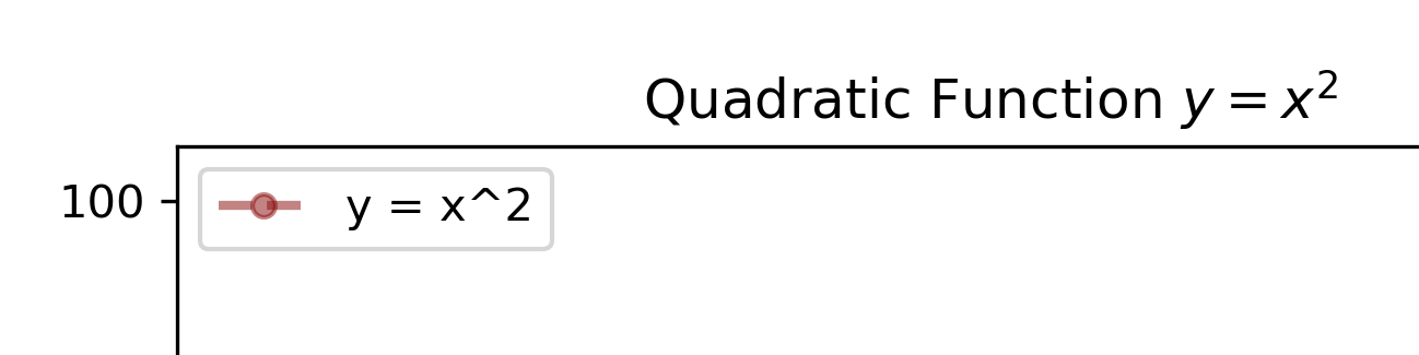
The title equation is correctly formatted using LaTeX, a document formatting system useful for mathematical and scientific notation.
To insert LaTeX formatting, you must surround your text with the dollar sign, $. LaTeX can be very complicated, so below is a short summary of useful information.
To insert LaTeX, surround symbols or maths with a dollar sign:
$math$.Insert superscript using
^and subscripts using_, e.g.$dm^3$or$H_2O$for \(dm^3\) or \(H_2O\). By default, this will only place the first character following the ^ or _ into the super- or subscript. To format multiple characters, use curly brackets {}. e.g.$cm^{-1}$or$C_{80}$to get \(cm^{-1}\) and \(C_{80}\) respectively.Insert Greek symbols using
\. E.g.$\lambda$for \(\lambda\) or$\Lambda$for \(\Lambda\), where capitalising the first letter of the name makes the symbol capital too.Other symbols can also be inserted using
\. For example,$\rightarrow$for \(\rightarrow\),$\times$for \(\times\),$\rightleftharpoons$for \(\rightleftharpoons\), and many more.A small gap can be inserted by writing
\. This is useful for units such as$mol \ dm^{-3}$, which now renders with a gap, \(mol \ dm^{-3}\). Without the backslash, the two units would be right next to each other.Fractions can be inserted by writing
$\frac{numerator}{denominator}$which renders as \(\frac{numerator}{denominator}\).
Exercise: Create a formatted plot
For the following data create a formatted line graph with the following design elements:
A dark blue solid line, with hexagonal markers of size 3.
The title “A Quadratic Function” in bold.
Axes titles “x-axis” and “y-axis” in bold.
Major ticks every integer on the x-axis, and every 10 on the y-axis. Make the numbers on the major ticks in extra small font.
10 minor ticks between each major tick.
Grey gridlines, where gridlines on the major ticks are twice as thick as on the minor axis.
The x-axis runs from -11 to 11, and the y-axis from -10 to 110.
x = [-10, -9, -8, -7, -6, -5, -4, -3, -2, -1, 0, 1, 2, 3, 4, 5, 6, 7, 8, 9, 10]
y = [100, 81, 64, 49, 36, 25, 16, 9, 4, 1, 0, 1, 4, 9, 16, 25, 36, 49, 64, 81, 100]
Hints:
A hexagonal marker is indicated with the symbol
"h"or"H"(depending on orientation).The size of numbers on the axes can be adjusted within the
plt.xticks()function using the keyword argumentsize="".Use the NumPy function
np.arange()to generate an array (list-like object) containing the axes ticks. The functionnp.arange(0,10,1)will generate an array of numbers starting with 0 and going up in steps of 1 up to (but not including) 10 i.e. [0,1,2,…8,9]. To get the tick to show, you must go past the number you want it to stop at.Python draws the graph in the order you write the code lines. Therefore, setting limits should be the last thing you do. This is because setting ticks auto-scales the axes, and if you set limits before that, it will then overwrite the scale.
Click to view answer
import matplotlib.pyplot as plt
import numpy as np

x = [-10, -9, -8, -7, -6, -5, -4, -3, -2, -1, 0, 1, 2, 3, 4, 5, 6, 7, 8, 9, 10]
y = [100, 81, 64, 49, 36, 25, 16, 9, 4, 1, 0, 1, 4, 9, 16, 25, 36, 49, 64, 81, 100]

# Line and markers
plt.plot(x, y, marker="h", markersize=3, linestyle="-", color="navy")

# Labels
plt.title("A Quadratic Function", weight="bold") # Insert title
plt.xlabel("x-axis", weight="bold") # x-axis label
plt.ylabel("y-axis", weight="bold") # y-axis label

# Ticks
## Major ticks
plt.xticks(np.arange(-12, 12, 1), size="x-small") # Major ticks on x-axis, numbers made small
plt.yticks(np.arange(-50, 120, 10), size="x-small") # Major ticks on y-axis, numbers made small
## Minor ticks
plt.xticks(np.arange(-12, 12, 0.1), minor=True) # Minor ticks on x-axis
plt.yticks(np.arange(-50, 120, 1), minor=True) # Minor ticks on y-axis

# Grid
plt.grid(True, which="major", color="grey", linewidth=1) # Major grid lines
plt.grid(True, which="minor", color="grey", linewidth=0.5) # Minor grid lines

# Limits
plt.xlim(-11, 11) # Set x-axis limits
plt.ylim(-10, 110) # Set y-axis limits

plt.show()
Plotting multiple datasets on the same graph#
To plot multiple sets of data on the same graph you include more than one of the plt.plot() and/or the plt.scatter() commands.
As multiple sets of data are to be plotted a legend should be included to indicate what each series represents. In the same plt.plot()/plt.scatter() code, after specifying the data to be plotted on the horizontal and vertical axes within the brackets, a comma should be added and then the option label="" used, which should describe the data. For example: `plt.scatter(x,y, label=”Quadratic”).
To display the legend, add the line plt.legend(), and a legend will be automatically generated.
from matplotlib import pyplot as plt

x = [0,1,2,3,4,5,6,7,8,9,10]
y_linear = [0,1,2,3,4,5,6,7,8,9,10]
y_quadratic = [0,1,4,9,16,25,36,49,64,81,100]
y_cubic = [0,1,8,27,64,125,216,343,512,729,1000]

plt.plot(x, y_linear, color="green", label="Linear $y = x$")
plt.plot(x, y_quadratic, color="red", label="Quadratic $y = x^2$")
plt.plot(x, y_cubic, color="blue", label="Cubic $y = x^3$")

plt.legend()

plt.title("Quadratic and Cubic Functions")

plt.show()
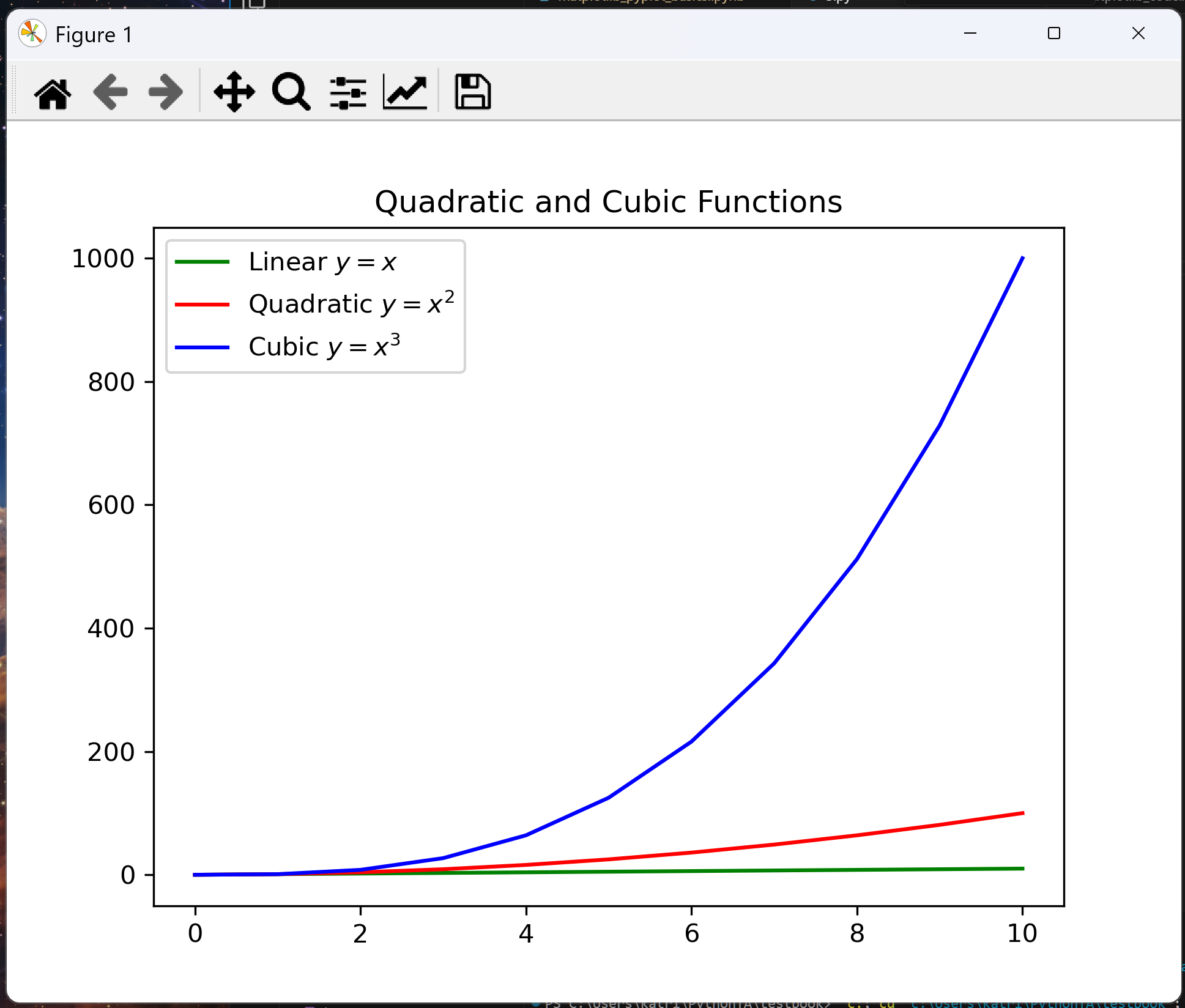
Other ways to use and customise a legend can be found in here.
Exercise: Plotting two series on the same graph and using a legend
Using Matplotlib.Pyplot, plot both the radii data from the 2nd period and the 3rd period of the periodic table onto the same graph.
Include a correctly formatted legend.
group = [13,14,15,16,17,18]
radii_2nd_period = [88,77,74,73,71,71]
radii_3rd_period = [125,118,110,104,99,98]
Click to view answer
import matplotlib.pyplot as plt

group = [13, 14, 15, 16, 17, 18]
radii_2nd_period = [88, 77, 74, 73, 71, 71]
radii_3rd_period = [125, 118, 110, 104, 99, 98]

plt.scatter(group,radii_2nd_period, label="2nd Period")
plt.scatter(group,radii_3rd_period, label="3rd Period")
plt.xlabel("Group")
plt.ylabel("Atomic radii / pm")
plt.legend()
plt.show()
Exporting plots as image files#
Once you have successfully created graphs with Python, you need to be able to save them for later use or to include them in other resources.
matplotlib has a command for this:
plt.savefig("file_name.png")
"file_name.png" is the name you choose for the saved graph. It will be saved in a .png format either in the same directory as your program is in, or in the root directory. To be sure your file ends up in the place you want it, you can specify a full directory. For a reminder on files and directories, look back at the files and file types lesson. Make sure you know where your image is being saved.
It is also possible to save a graph as a PDF file by changing the .png extension to .pdf.
Note the plt.savefig() command must go before the plt.show() command. If you do not do this, then the saved image file will be blank.
If you save two graphs with the same name in the same directory, the previous plot will be written over by the newer plot. Give all your plots meaningful names to avoid this.
Exercise: Export a plot as an image
Take the following code generating some functions and add a line of code that will save the figure as an image somewhere on your device. This could be a directory labelled “Images” or “Plots”, for example.
from matplotlib import pyplot as plt

x = [0,1,2,3,4,5,6,7,8,9,10]
y_linear = [0,1,2,3,4,5,6,7,8,9,10]
y_quadratic = [0,1,4,9,16,25,36,49,64,81,100]
y_cubic = [0,1,8,27,64,125,216,343,512,729,1000]

plt.plot(x, y_linear, color="green", label="Linear $y = x$")
plt.plot(x, y_quadratic, color="red", label="Quadratic $y = x^2$")
plt.plot(x, y_cubic, color="blue", label="Cubic $y = x^3$")
plt.legend()
plt.title("Linear, Quadratic and Cubic Functions")
plt.show()
Click to view answer
from matplotlib import pyplot as plt

x = [0,1,2,3,4,5,6,7,8,9,10]
y_linear = [0,1,2,3,4,5,6,7,8,9,10]
y_quadratic = [0,1,4,9,16,25,36,49,64,81,100]
y_cubic = [0,1,8,27,64,125,216,343,512,729,1000]

plt.plot(x, y_linear, color="green", label="Linear $y = x$")
plt.plot(x, y_quadratic, color="red", label="Quadratic $y = x^2$")
plt.plot(x, y_cubic, color="blue", label="Cubic $y = x^3$")
plt.legend()
plt.title("Linear, Quadratic and Cubic Functions")
pls.savefig("C:/Users/Lilly/Plot-Images/functions_plot.png")
plt.show()
Implicit and Explicit methods#
As hinted at earlier, Matplotlib has two main interfaces: the implicit “pyplot” interface which is functions based, and the explicit “Axes” interface which is object-based.
The implicit interface only keeps track of the last Figure and Axes created, and adds design elements automatically to the object it thinks the user wants. This uses fewer lines of code.
The explicit interface defines each Figure or Axes object and design elements must be added to that object explicitly, building the visualisation step by step. This uses more lines of code, but results in less confusion for a long program with many outputs.
Implicit form |
Explicit form |
|---|---|
Pyplot interface, functions based |
Axes interface, object-based |
Elements are automatically applied to the figure Python thinks you are working on. |
You define each figure and call their specific names when adding elements. |
Fewer lines of code needed. |
More lines of code needed. |
Useful if you only want to produce one figure, but may cause issues with multiple. |
Better if you are producing multiple figures. |
Figure is generated automatically with |
Figure is generated using |
Design elements are called using |
Design elements are called using the variable describing the axis you want to apply the design elements to, often called |
Design functions are not preceded by the word ‘set’, as in |
Design functions are usually preceded by the word ‘set’, as in |
We have already seen above how the implicit form of Matplotlib.Pyplot works. Here, we will explain how the explicit form works.
fig = plt.figure()
ax = fig.subplots()
ax.plot([1,2,3,4], [1,4,9,16])
plt.show()
In the first line,
fig = plt.figure(), a blank figure is created. The figure is like the backing for your plot, an empty canvas onto which you can put diagrams and plots. You can put multiple plots onto the same figure. You can also resize your figure to the dimensions you want. The figure is assigned the variable namefig.In the second line,
ax = fig.subplots(), a set of axes is added onto the figure. The axes are given the variable nameax.In the third line,
ax.plot([1,2,3,4], [1,4,9,16]), those data points are plotted onto the axes namedax.Finally, the plot is displayed to the screen using
plt.show().
Design elements can be added to the axes in a similar way as implicitly, except the function names are generally preceded by the word set, and refer to the ax variable name, not plt. For example, ax.set_title("Plot Title")
Additional Matplotlib capabilities.#
There are many other capabilities that may be of use to you. Here are some links to potentially useful MarPlotLib documentation.
Make a plot with log scaling on the y axis. Similar functions exist for the x axis, and to make both axes scale logarithmically.
Adding error bars.
Creating a bar graph.
Creating a pie chart.
Creating a 3D plot.
Creating a stem plot.
A full list of matplotlib.pyplot functions can be found in the documentation here.
Further Practice#
Question 1#
Write a function that will take plot x and y data according to a pre-set design, display it to the screen, and save it to a specified file. The function should allow the user to assign a title, a filename or filepath, and names for the x and y axes. The title, filename, and axes labels should take logical default values. Don’t forget a dosctring!
Here is some data you can use to test your code:
gaussian_x = [-3.0, -2.5, -2.0, -1.5, -1.0, -0.5, 0.0, 0.5, 1.0, 1.5, 2.0, 2.5, 3.0]
gaussian_y = [0.01, 0.04, 0.14, 0.32, 0.61, 0.88, 1.0, 0.88, 0.61, 0.32, 0.14, 0.04, 0.01]
In you can’t remember how to do this, look back at the functions lesson to revise functions, default arguments, and docstrings.
Click to view answer
The code below takes two positional arguments, and four default arguments. It will create a line plot formatted in a specific style, and the user can specify the title, filename/path, and x and y labels.
import matplotlib.pyplot as plt


def plot_line(x, y, title="My Plot", filename="my_plot.png", x_label="x-axis", y_label="y-axis"):
    """
    Plot a formatted line graph with specified x and y data, display plot and save it as an image.

    Parameters:
    ============
    x : list
        x-axis data
    y : list
        y-axis data
    title : str, optional
        Title of the plot (default is "My Plot")
    filename : str, optional
        Name of the file to save the plot (default is "my_plot.png").
        You can specify a full path if you want to save it in a specific directory.
    x_label : str, optional
        Label for the x-axis (default is "x-axis")
    y_label : str, optional
        Label for the y-axis (default is "y-axis")

    Returns:
    ========
    None
    """

    # Plot line
    plt.plot(x, y, marker="h", markersize=3, linestyle="-", color="navy")

    # Set labels
    plt.title(title, weight="bold")  # Insert title
    plt.xlabel(x_label, weight="bold")  # x-axis label
    plt.ylabel(y_label, weight="bold")  # y-axis label

    # Add grid
    plt.grid(True, which="major", color="grey", linewidth=1)  # Major grid lines
    plt.grid(True, which="minor", color="grey", linewidth=0.5)  # Minor grid lines

    # Allow automatic minor ticks to be generated
    plt.minorticks_on()

    # Limits and ticks are set automatically based on data

    # Save and display the figure
    plt.savefig(filename)
    plt.show()
    return


gaussian_x = [-3.0, -2.5, -2.0, -1.5, -1.0, -0.5, 0.0, 0.5, 1.0, 1.5, 2.0, 2.5, 3.0]
gaussian_y = [0.01, 0.04, 0.14, 0.32, 0.61, 0.88, 1.0, 0.88, 0.61, 0.32, 0.14, 0.04, 0.01]

plot_line(gaussian_x, gaussian_y, title="Gaussian Plot", filename="./code/images/gaussian_plot.png")
In this plot design, we have used the Pyplot function minorticks_on() which automatically generates minor ticks. Since we have not specified tick locations, Matplotlib automatically generates them.
The function is called just using plot_line().
Don’t forget to add a docstring to describe what your function does!
Question 2#
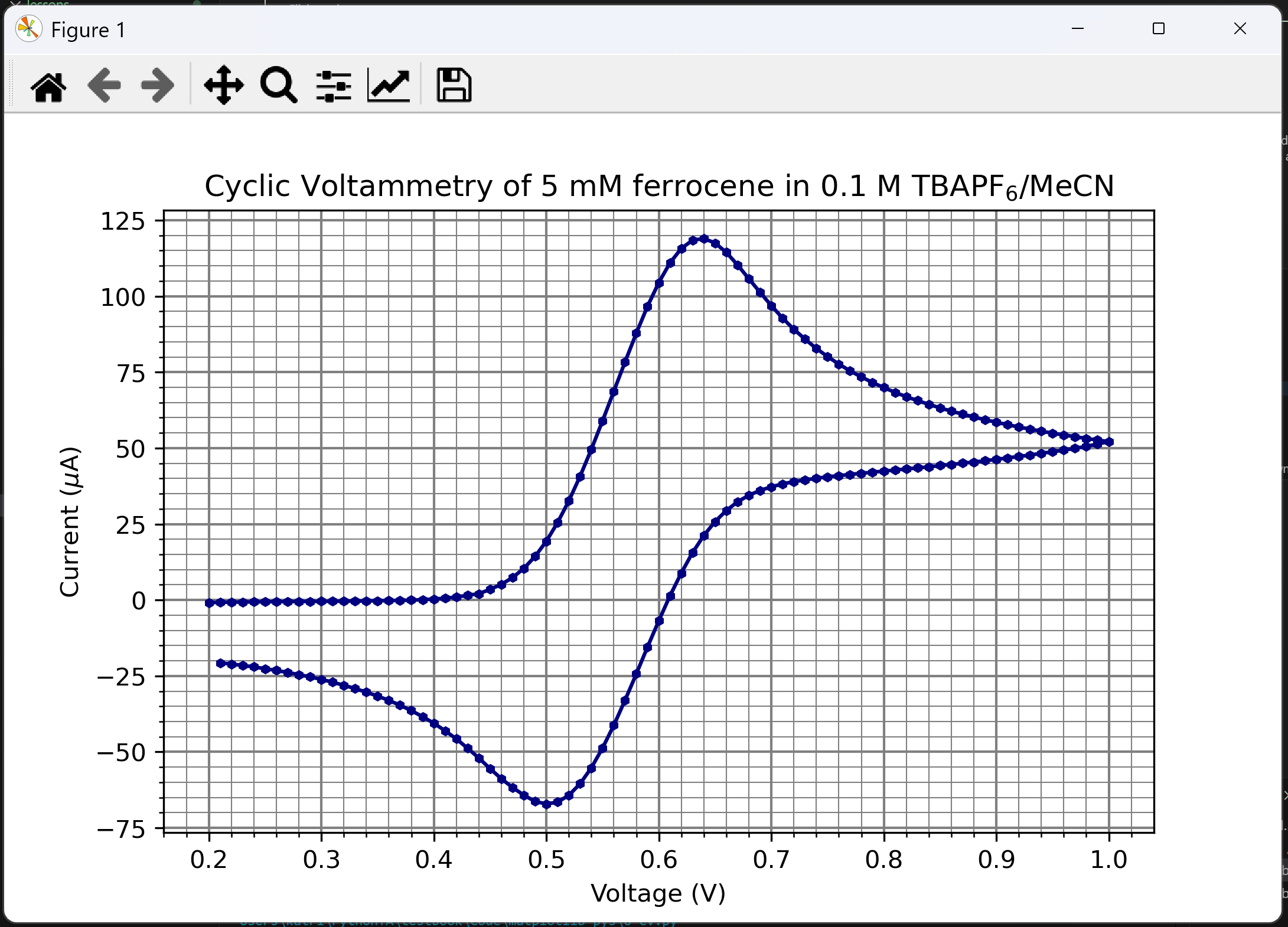
Cyclic voltammetry (CV) is an electrochemical technique which measures the current in an electrochemical cell against voltage, first a forward scan from low voltage to high voltage, followed by a reverse scan. A cyclic voltammogram is the plot generated from each measurement of current against voltage. The shape of the cyclic voltammogram can tell you whether the reaction at the electrode is electrochemically reversible, irreversible, or quasi-irreversible.
Use Pyplot and the function from the previous question to plot a cyclic voltammetry curve from cyclic_voltammetry_data.csv.
You should get a voltammogram that looks something like this (make sure to relabel the title and axes appropriately!):

Hint: Make sure to open the CSV file and look at the headers to figure out how to parse them. They may also give you information that you should label on your plot.
Click to view answer
Your cyclic voltammogram should look something like this:
Our code can use the function we defined in the previous question to generate this plot. We first import Pyplot, then define our function, then we can insert the code that reads our CSV file, extracts the data, and calls the function to plot our cyclic voltammogram.
from matplotlib import pyplot as plt


def plot_line(x, y, title="My Plot", filename="my_plot.png", x_label="x-axis", y_label="y-axis"):
    """
    Plot a formatted line graph with specified x and y data, display plot and save it as an image.

    Parameters:
    ============
    x : list
        x-axis data
    y : list
        y-axis data
    title : str, optional
        Title of the plot (default is "My Plot")
    filename : str, optional
        Name of the file to save the plot (default is "my_plot.png").
        You can specify a full path if you want to save it in a specific directory.
    x_label : str, optional
        Label for the x-axis (default is "x-axis")
    y_label : str, optional
        Label for the y-axis (default is "y-axis")

    Returns:
    ========
    None
    """

    # Plot line
    plt.plot(x, y, marker="h", markersize=3, linestyle="-", color="navy")

    # Set labels
    plt.title(title)  # Insert title
    plt.xlabel(x_label)  # x-axis label
    plt.ylabel(y_label)  # y-axis label

    # Add grid
    plt.grid(True, which="major", color="grey", linewidth=1)  # Major grid lines
    plt.grid(True, which="minor", color="grey", linewidth=0.5)  # Minor grid lines

    # Allow automatic minor ticks to be generated
    plt.minorticks_on()

    # Limits and ticks are set automatically based on data

    # Save and display the figure
    plt.savefig(filename)
    plt.show()
    return


# Read data from CSV file and save to lists
with open("cyclic_voltammetry_data.csv", "r") as file:
    x_data = []
    y_data = []
    file = file.read()
    content = file.split("\n")
    for line in content:
        if line[0] == "#":  # Skip header line
            continue
        else:
            line = line.split(",")
            x_data.append(float(line[0]))
            y_data.append(float(line[1]))

# Plot the data
plot_line(
    x_data,
    y_data,
    title="Cyclic Voltammetry of 5 mM ferrocene in 0.1 M TBAPF$_6$/MeCN",
    filename="cyclic_voltammetry_plot.png",
    x_label="Voltage (V)",
    y_label="Current ($\mu$A)",
)
Make sure you have specified the correct file directory to access the CSV file!
You may notice in this solution that when we call the function plot_line, the arguments are stacked vertically. This is a style chosen because otherwise the line becomes very long and difficult to read. Readability and consistency is very important when programming in Python, and so there is a style guide called Pep8 which guides the best practice when writing Python code. Have a look at the Python style guide lesson for a summary of the best style practices.
Summary#
Import Matplotlib.Pyplot using the command:
from matplotlib import pyplot as plt.Generate a line graph using
plt.plot(x, y), where x and y are lists (or numpy arrays) of corresponding x and y coordinates.Generate a scatter graph using
plt.scatter(x, y), where x and y are lists (or numpy arrays) of corresponding x and y coordinates.Use
plt.show()to display your plot.Add labels using
plt.title("Plot Title"),plt.xlabel("x-axis title"),plt.ylabel("y-axis label")andplt.legend("Legend").Add graph styles using
plt.grid(),plt.xticks(),plt.yticks(), and set minor ticks either usingplt.minorticks_on()orplt.xticks([0,1,2,...,100], minor=True). Set axis limits usingplt.xlim()orplt.ylim().Use LaTeX to format strings into scientific notation.
Insert LaTeX by surrounding the items with dollar signs
$.Insert superscript using
$cm^{-1}$and subscript using$C_{80}$.Insert Greek letters using backslash, e.g.
$\pi$(\(\pi\)) or$\Pi$(\(\Pi\)).Insert other symbols using a backslash, e.g.
$\rightarrow$for \(\rightarrow\),$\times$for \(\times\),$\rightleftharpoons$for \(\rightleftharpoons\)Insert a small gap using a backslash, e.g.
$mol \ dm^{-3}$to create a gap between ‘mol’ and ‘dm’, \(mol \ dm^{-3}\)Add fractions using
$\frac{numerator}{denominator}$, \(\frac{numerator}{denominator}\).
Use more than one
plt.plot()orplt.scatter()line to plot multiple datasets on the same axis.Add labels to each
plt.plot()to auto-generate a legend. E.g.plt.plot(x, y, label="Data Series A")
The implicit interface only keeps track of the last figure and axis created. It requires fewer lines of code, and elements are added using
plt.and the function.The explicit interface requires a specific figure and axis to be called to add design elements. It requires more lines of code, elements are added using
ax.(where ax is often the variable name given to a certain axis), and functions are usually preceded byset_.Save your files using
plt.savefig().Understand the difference between Matplotlib’s implicit form (used throughout the lesson), and its explicit form.
Useful Matplotlib links#
List of Matplotlib.Pyplot functions
Styles:
Graph elements:
Adding multiple subplots to the same figure. This adds multiple plots side-by-side on the same figure, and is usually accessed using Matplotlib’s explicit interface.
Plot with log scaling on the y axis. Similar functions exist for the x axis, and to make both axes scale logarithmically.
Adding error bars.
Plot types: